Product strategy · UX design · Curtin University · July 2024
Refining My Wellbeing
Designing a product to help students with their mental health.
ROLE
UX & Development Manager
DISCIPLINES
Product strategy · UX research
Facilitation · Capability building
TEAM
3 developers · 4 UX designers
COMPLETED
July 2024
82%
of students said the tool helped in times of stress
5k+
students now have a lower-friction path to support
8.5%
increase in traffic to key mental health resources
VC commendation
For designing a fit-for-purpose mental health tool
THE PROBLEM
A beta product that wasn’t solving the right problem
Curtin University’s students needed more mental health support and their counselling services struggled to meet this growing demand.
My Wellbeing was a beta product struggling to find its footing. It was a "triage" tool that provided mental health resources tailored to a students emotional state. The product was built to take temporary pressure off Curtin’s overworked counselling services, but user testing showed it was adding stress to the student experience.
A stressed student would open the app looking for help and they'd be met with a multi-step questionnaire. Most left before finishing it. The product designed to reduce pressure on counselling services was adding pressure to the students who needed help most.
When I joined, the brief was to roll out the next phase of development. I started by figuring out how we could solve for the true needs of students so we could solve the right problem.
Product strategy review
I conducted discovery work to understand what drove product decisions and how well we addressed student needs. This uncovered some areas for concern and pushed me to reconsider our strategy.
FEATURE CREEP
Unclear product goals
My Wellbeing had ambitious goals. Tracking moods, providing a reward system, improving grades, triaging mental health all at once. The true value had been diluted over time.
RESEARCH GAP
Misled by a lack of user data
Product decisions were led by a small data-set of user research that didn’t provide a true representation of the student experience.
STRATEGY GAP
Business-led, not student-led
The tool was designed to solve a business problem, counselling wait times, rather than what a student actually experiences when they're struggling.
MY ROLE
Leading a team mid-transition
I managed 3 senior developers and 4 UX designers with a remit of 20+ university applications. The main one being OASIS, the student portal. Two UX designers worked with me specifically on My Wellbeing.
My role was to lead the design thinking and product strategy of My Wellbeing, while building UX capabilities within the team. This was coupled with other management responsibilities such as setting team priorities, managing stakeholder relationships, running sprint ceremonies, and steering a longer-term shift from reactive service team to proactive product team. We were decommissioning legacy products to free up capacity and trying to build new things. My Wellbeing was one of those new things.
USER RESEARCH
The disconnect between what students say and do
I led a round of qualitative research with 15 students to map their mindset during high-stress periods. When we previously surveyed students, they said they wanted a mental health dashboard (mood tracking, ongoing support, personalised check-ins) but the reality was quite different.
Students only access Curtin's mental health services reactively, when they're already at their limit. In that state, they don't want to answer questions. They don't want to be triaged. They don't want to invest time or cognitive energy into anything that doesn’t directly solve their imminent problem.
“I don’t know if this will just add to my stress.”
It was this gap between stated preference and true behaviour thats was the insight to drive the next round of changes. Students didn't want to be diagnosed, they wanted to get in, get help and get out.
ACCESS TO INFORMATION
"I need it right there in front of me"
When a student is in distress, they don't want to answer multiple questions. They want a solution, right now.
COGNITIVE OVERLOAD
“This just feels like a lot.”
The UI was too complex and there were too many steps to take before getting the information they need.
MISALIGNED FEATURES
“I don’t want to track my mood, I want to get help”
Students didn't want the tool to "diagnose" them; they wanted it to show them what help was available.
CREATING ACHETYPES
Three users, one clear focus
The research was rich enough to identify three rough user types based on how students engaged with university support depending on their stress level and situation.
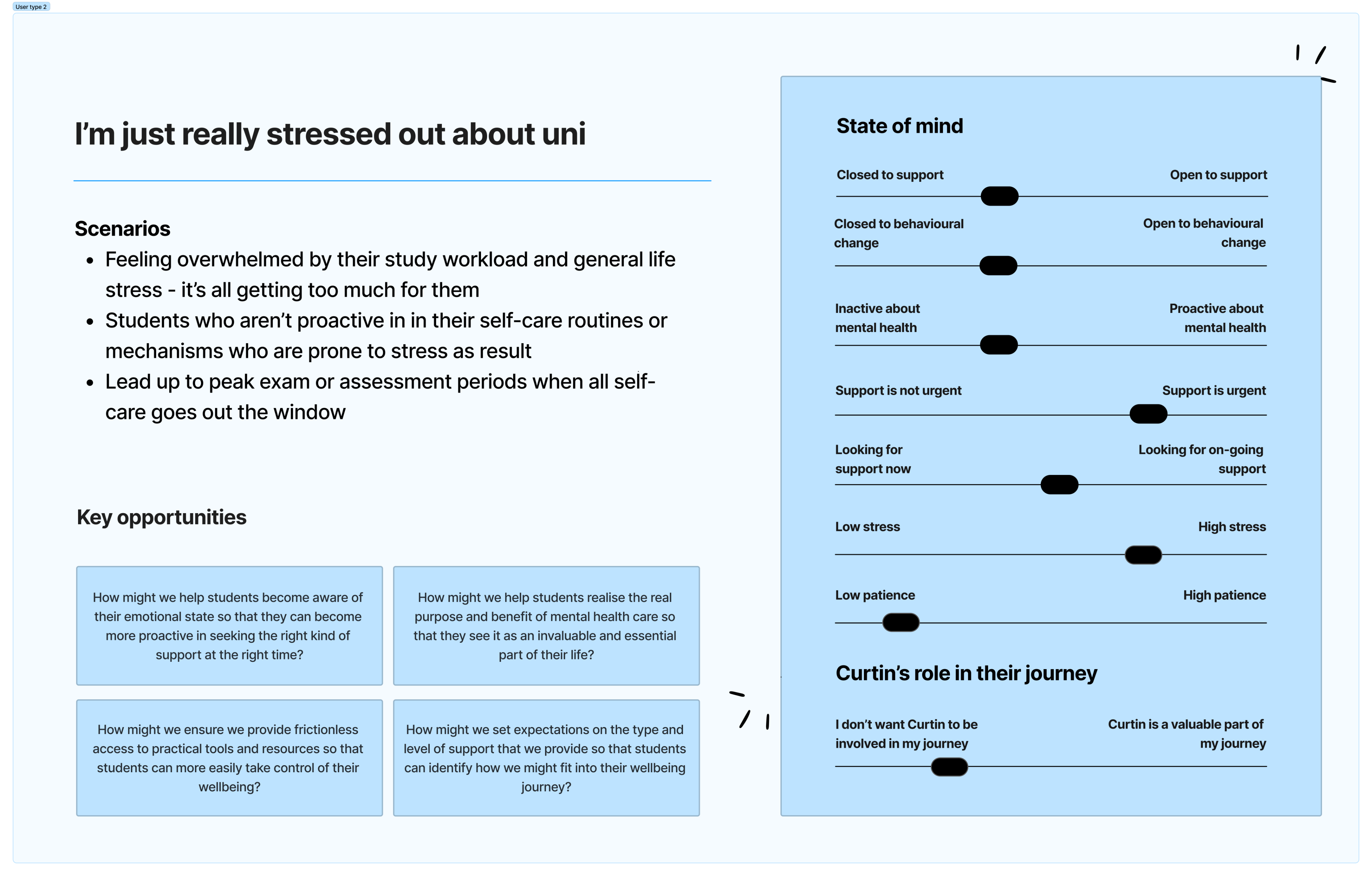
The self-reliant
Low awareness of Curtin services. Unlikely to seek formal support. Prefers to handle things independently.
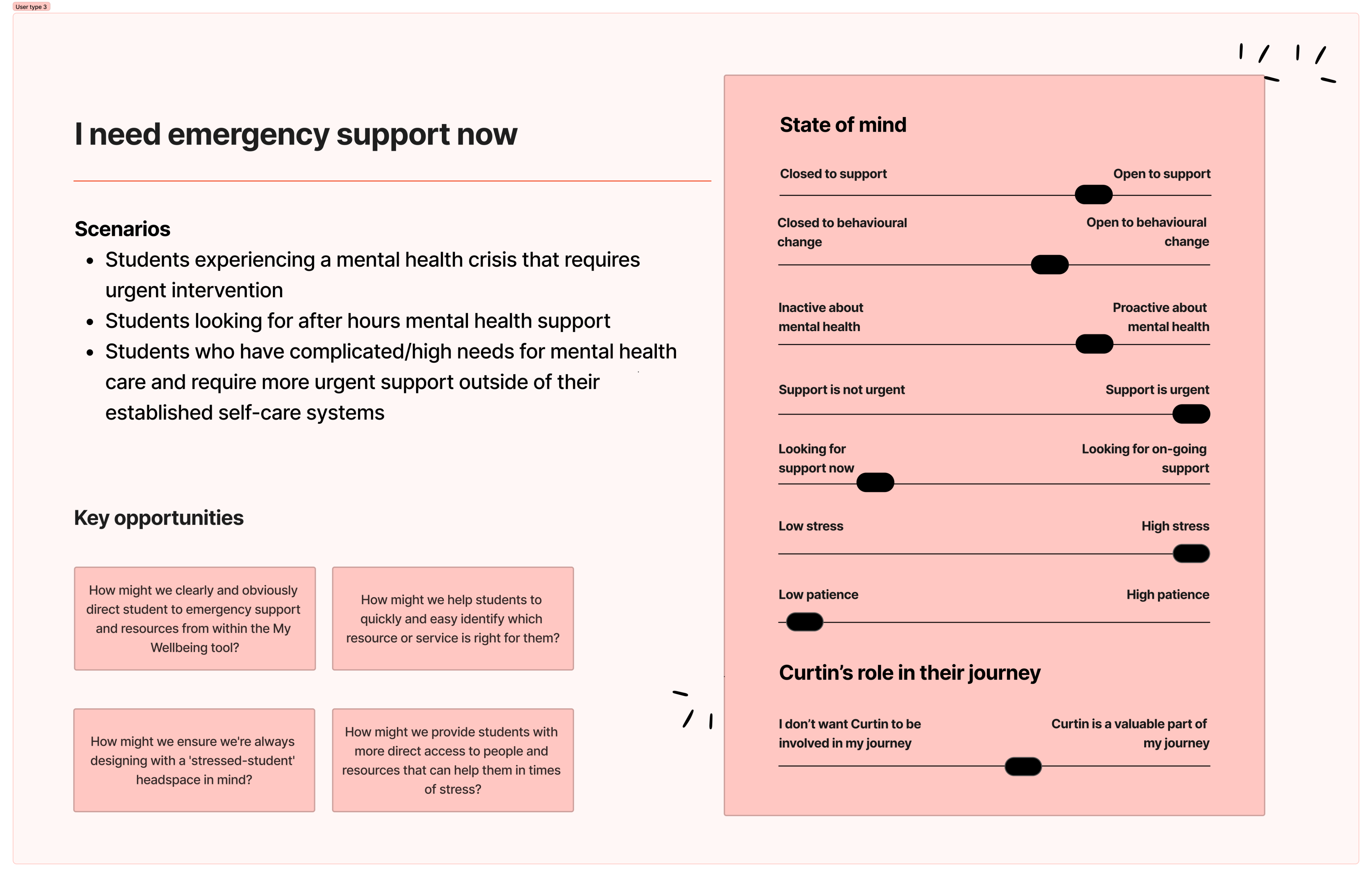
The overwhelmed
Knows they need help but is too stressed to navigate complex systems to find it.
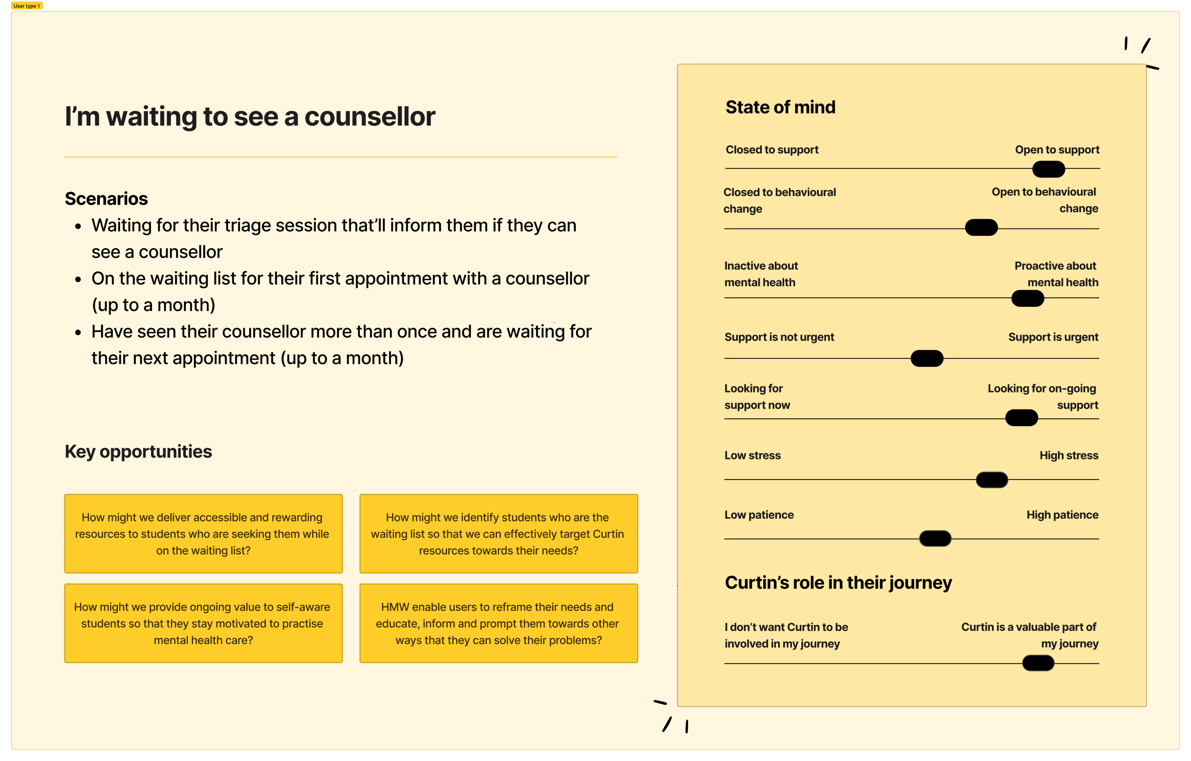
THE FOCUS
Waiting for a counsellor
Already engaged with Curtin services. On a waitlist. Actively looking for something to bridge the gap.
Why focus on ‘Waiting for a counsellor’ archetype?
This group was already aware of Curtin's services, already trusted the university for support, and actively looking for something while they waited. Easiest to reach, most motivated to engage. Narrowing the scope to them would allow us to create a targeted product with a refined scope we could build on in later releases.
STAKEHOLDER PIVOT
Redefine the strategy with stakeholders
The bicycle vs the Ferrari
I sat down with the university stakeholders to walk them through the reality of the student experience.
I explained that we were trying to build a Ferrari - a complex, personalised wellbeing dashboard with mood tracking, academic integration, and tailored triage pathways. What students actually needed was a bicycle. A simple, reliable way to find a resource when they needed one.
While we could still have the Ferrari, it would be more cost effective to build a simple, functional MVP that we can use to capture behavioural insights. As we learn more about user engagement and needs, we can build the cool features to meet those needs.
The new strategic direction was clear
REVISED PROBLEM STATEMENT
How might we ensure students who are seeking support have easy access to information that can help them help themselves in times of stress?
Before
Diagnosing & triaging

After
Providing immediate access
CO-DESIGN WORKSHOP
Building it with stakeholders, not for them
I ran a co-design workshop with stakeholders to translate the new direction into testable prototypes. Having them in the room building it meant they understood and felt ownership over product decisions.
Two major changes came out of this workshop
IMPROVE ACCESS TO INFORMATION
One page for everything
We stripped the product back to a simple listing page that displayed all resources upfront. Removing mood tracking and all unnecessary features.
REDUCE COGNITIVE OVERLOAD
Triage became filtering
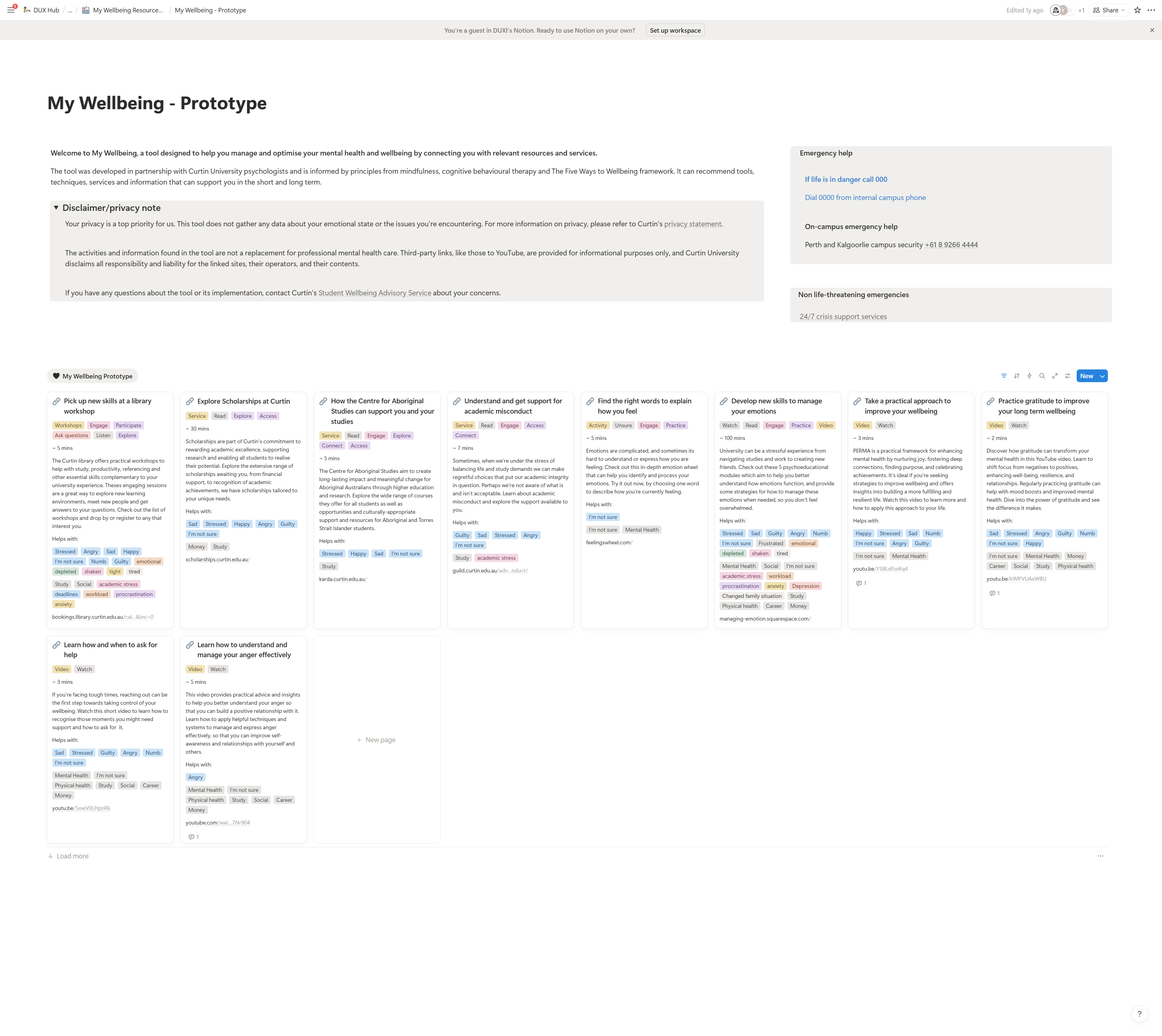
Students can filter by emotion or situation (e.g., "Exam Stress" or "Loneliness") and see all relevant resources.
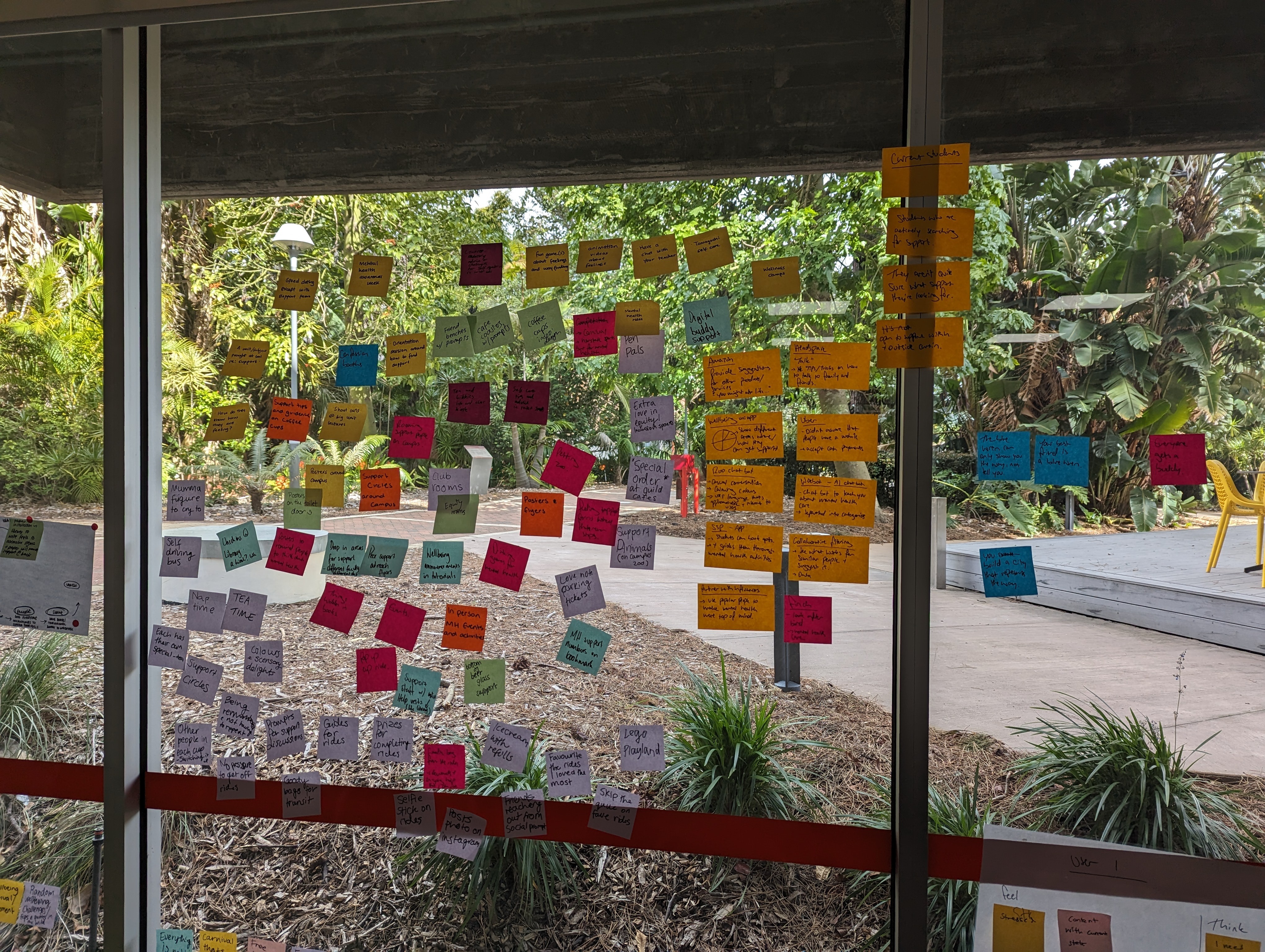
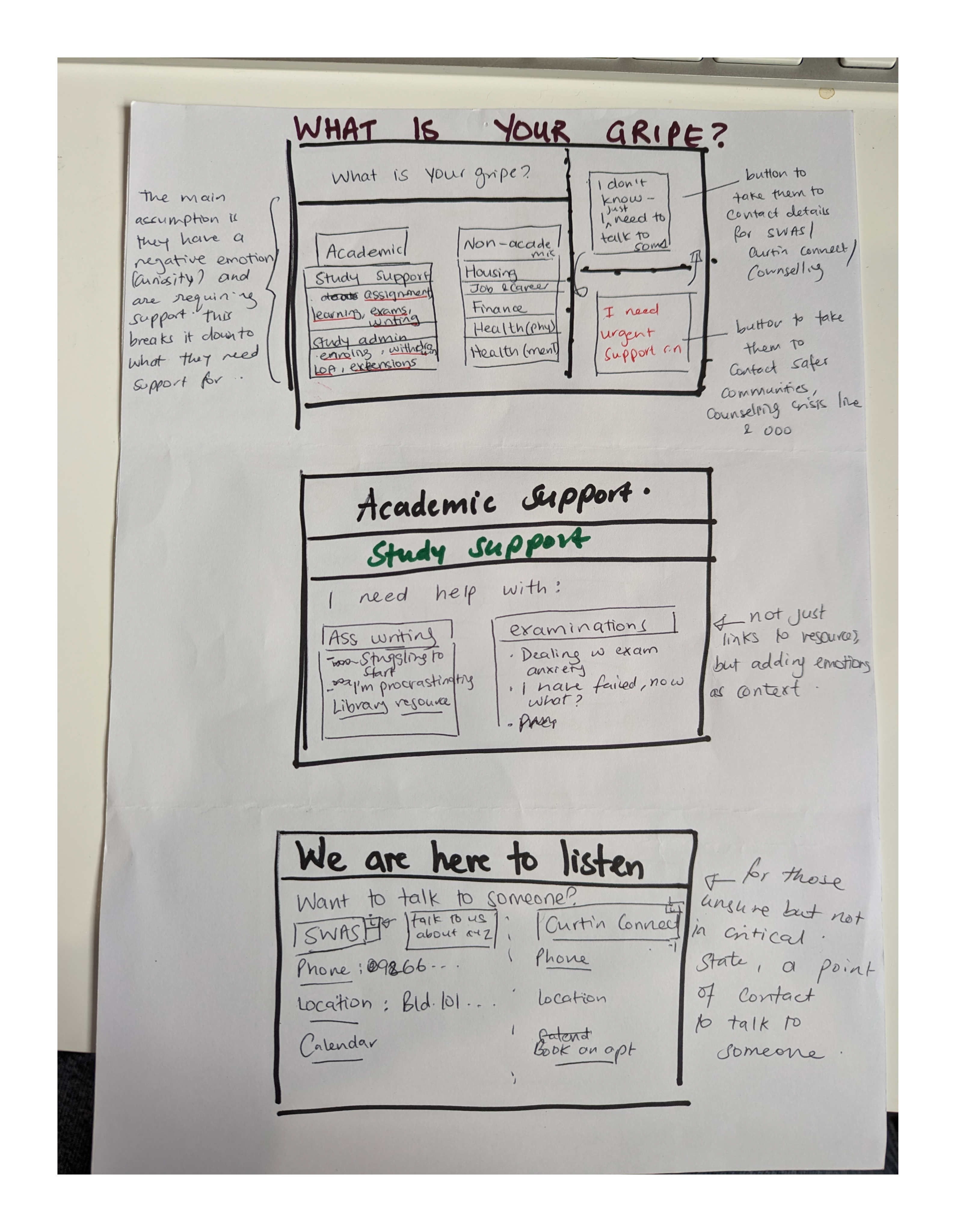
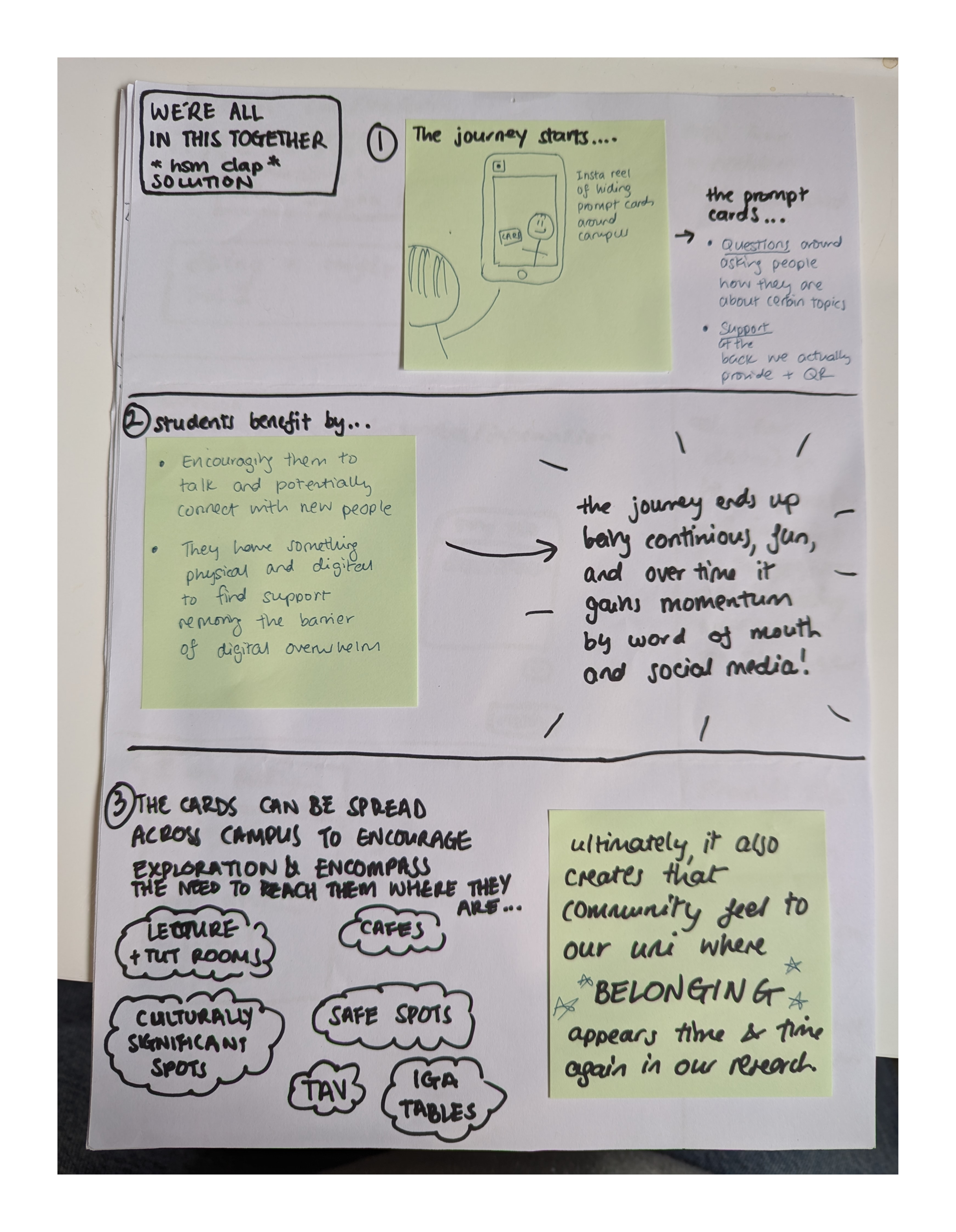
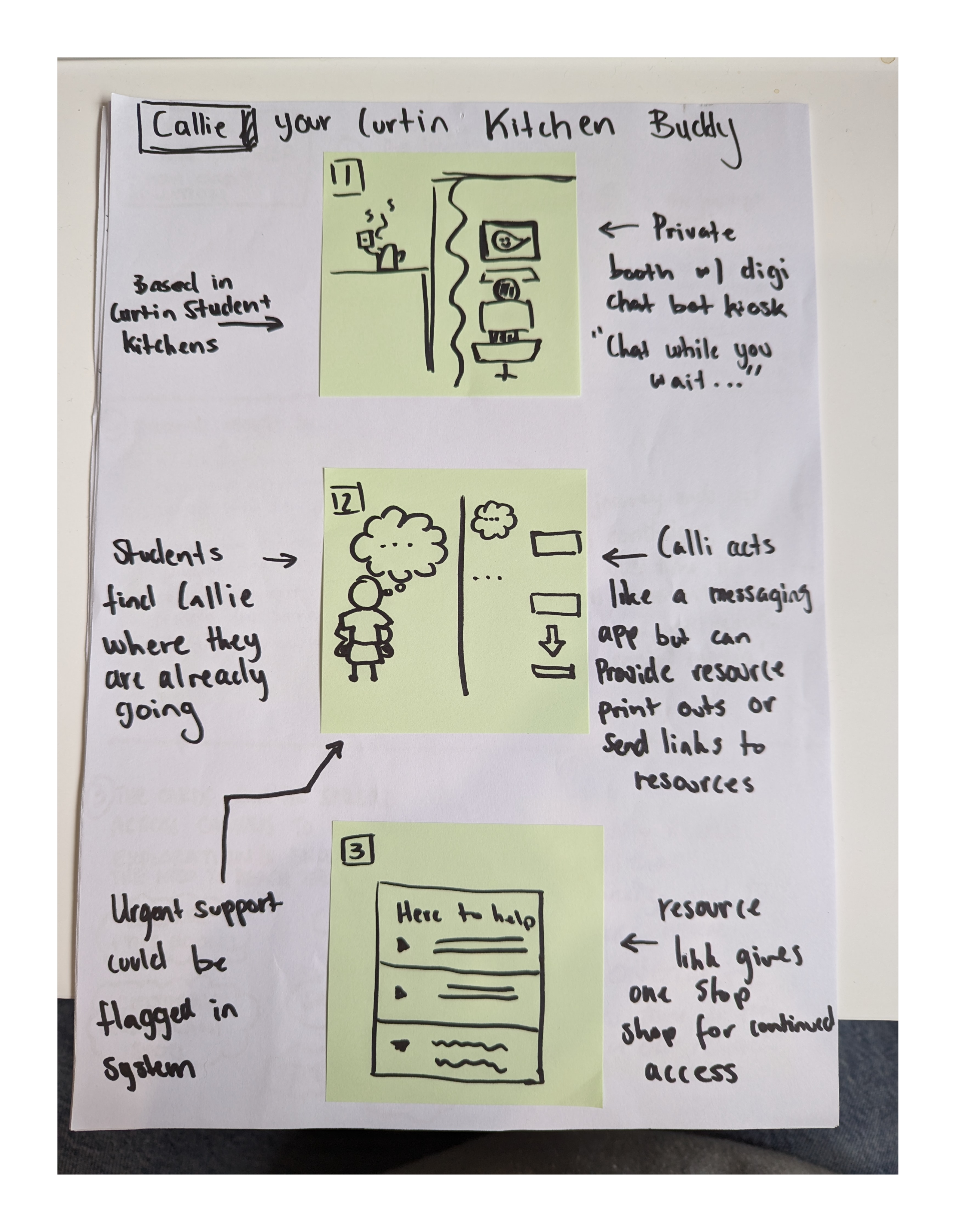
Paper prototypes of the ‘Dream state’
PROTOTYPE & TESTING
Testing the new product
We decided to build a functional prototype in Notion instead of Figma. Notion let us build a functional prototype and a live content management system in the same place. We could test taxonomy logic, filter functionality, and real content without using limited dev resources.
KEY FINDINGS
What the research revealed
We uncovered several issues that were previously unknown to the business both above and below the line of visibility. It seems technology was the biggest bottle neck for internal teams.
IMPROVED DISCOVERY
Students found services they never knew existed
Having everything scannable in one place revealed how fragmented the previous experience was. People were finding things they wished they new about earlier.
EASE OF USE
"This is so easy"
Students loved the simplicity of the tool and found it easy to use the filters to browse resources.
IMPROVEMENTS NEEDED
Students wanted more emotions to filter with
Students wanted "numb" and "I'm not sure." When someone can't name what they're feeling, those filters are the difference between engaging and leaving.
DESIGN SOLUTION
The final product (MVP)
This is the latest version of the design. Limited by strict brand guidelines, we focused on functionality over form and will continue to update as we gather student feedback in upcoming sprints.
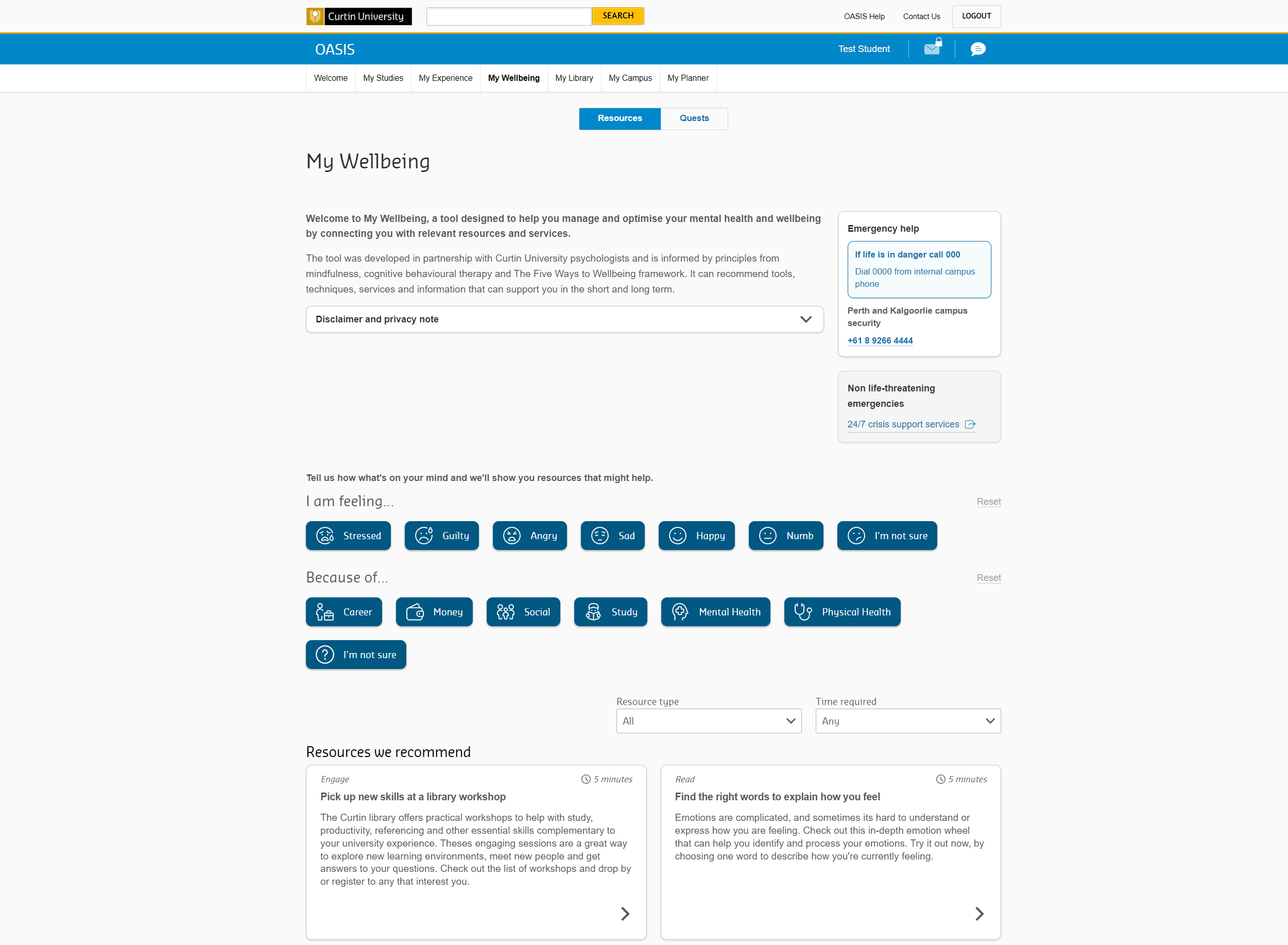
MOMENT OF GLORY
Presenting to the Vice Chancellor
Word had gotten round about the work we had done with My Wellbeing and the team were invited to present the prototype to the Vice Chancellor. We did a showcase of our Notion prototype (final product wasn’t yet built) alongside key insights from testing for the VC and senior stakeholders from every health and wellbeing service in the university.
Her response was unambiguous. She supported the tool's development, wanted to see post-launch feedback, and pushed us to work closely with counselling services and Student Connect to promote it. More than that, she framed the gap we'd identified, students struggling to find wellbeing support online, as a critical institutional problem that needed a coordinated university-wide response.
For a small digital team, having the VC treat our work as evidence of a systemic issue was a brilliant boost to team morale and rise to our profile.
RESULTS
By narrowing the scope, we increased the value
82%
of students said My Wellbeing was helpful in times of stress
8.5%
increase in traffic to key mental health resource pages in 3 months
5k+
students now have a lower-friction path to support
IMPROVED TEAM PROCESSES
Building a product from scratch was a new experience for the team and this project paved the way for a more efficient design process. We learnt how to build small and test regularly. Our projects are now front loaded with high-quality user research to help us identify and solve the right problem.
REFLECTION
Learnings about mental health and product strategy
Designing for mental health means designing for people who are at their limits. They have no patience, and no tolerance for friction. If your product asks anything unexpected, or isn’t direct in offering a solution, you've already lost them.
As cliche as it is, this project taught me that “less is more” is a great product strategy. By delivering one great, low-friction feature instead of five average ones, we built a foundation that actually supports students when they need it most.
We learned to deliver small, test often, and, most importantly, change tact when the data tells us we’re wrong.
All projects
Refining My Wellbeing
Designing a product to help students with their mental health.
Read case study →
DesigningResearcher profiles
Helping researchers promote themselves online to increase partnership, global funding and collaboration opportunities.
Read case study →
Mapping
Water outages
Mapping the end-to-end water outage experience to drive systemic change for Water Corporation.
Read case study →
Product strategy · UX design · Curtin University · July 2024
Refining My Wellbeing
Designing a product to help students with their mental health.
ROLE
UX & Development Manager
COMPLETED
July 2024
DISCIPLINES
Product strategy · UX research
Facilitation · Capability building
TEAM
3 developers · 4 UX designers
82%
of students said the tool helped in times of stress
5k+
students now have a lower-friction path to support
8.5%
increase in traffic to key mental health resources
VC commendation
For designing a fit-for-purpose mental health tool
THE PROBLEM
A beta product that wasn’t solving the right problem
Curtin University’s students needed more mental health support and their counselling services struggled to meet this growing demand.
My Wellbeing was a beta product struggling to find its footing. It was a "triage" tool that provided mental health resources tailored to a students emotional state. The product was built to take temporary pressure off Curtin’s overworked counselling services, but user testing showed it was adding stress to the student experience.
A stressed student would open the app looking for help and they'd be met with a multi-step questionnaire. Most left before finishing it. The product designed to reduce pressure on counselling services was adding pressure to the students who needed help most.
When I joined, the brief was to roll out the next phase of development. I started by figuring out how we could solve for the true needs of students so we could solve the right problem.
Product strategy review
I conducted discovery work to understand what drove product decisions and how well we addressed student needs. This uncovered some areas for concern and pushed me to reconsider our strategy.
FEATURE CREEP
Unclear product goals
My Wellbeing had ambitious goals. Tracking moods, providing a reward system, improving grades, triaging mental health all at once. The true value had been diluted over time.
RESEARCH GAP
Misled by a lack of user data
Product decisions were led by a small data-set of user research that didn’t provide a true representation of the student experience.
STRATEGY GAP
Business-led, not student-led
The tool was designed to solve a business problem, counselling wait times, rather than what a student actually experiences when they're struggling.
MY ROLE
Leading a team mid-transition
I managed 3 senior developers and 4 UX designers with a remit of 20+ university applications. The main one being OASIS, the student portal. Two UX designers worked with me specifically on My Wellbeing.
My role was to lead the design thinking and product strategy of My Wellbeing, while building UX capabilities within the team. This was coupled with other management responsibilities such as setting team priorities, managing stakeholder relationships, running sprint ceremonies, and steering a longer-term shift from reactive service team to proactive product team. We were decommissioning legacy products to free up capacity and trying to build new things. My Wellbeing was one of those new things.
USER RESEARCH
The disconnect between what students say and do
I led a round of qualitative research with 15 students to map their mindset during high-stress periods. When we previously surveyed students, they said they wanted a mental health dashboard (mood tracking, ongoing support, personalised check-ins) but the reality was quite different.
Students only access Curtin's mental health services reactively, when they're already at their limit. In that state, they don't want to answer questions. They don't want to be triaged. They don't want to invest time or cognitive energy into anything that doesn’t directly solve their imminent problem.
“I don’t know if this will just add to my stress.”
It was this gap between stated preference and true behaviour thats was the insight to drive the next round of changes. Students didn't want to be diagnosed, they wanted to get in, get help and get out.
ACCESS TO INFORMATION
"I need it right there in front of me"
When a student is in distress, they don't want to answer multiple questions. They want a solution, right now.
COGNITIVE OVERLOAD
“This just feels like a lot.”
The UI was too complex and there were too many steps to take before getting the information they need.
MISALIGNED FEATURES
“I don’t want to track my mood, I want to get help”
Students didn't want the tool to "diagnose" them; they wanted it to show them what help was available.
CREATING ACHETYPES
Three users, one clear focus
The research was rich enough to identify three rough user types based on how students engaged with university support depending on their stress level and situation.
The self-reliant
Low awareness of Curtin services. Unlikely to seek formal support. Prefers to handle things independently.
The overwhelmed
Knows they need help but is too stressed to navigate complex systems to find it.
THE FOCUS
Waiting for a counsellor
Already engaged with Curtin services. On a waitlist. Actively looking for something to bridge the gap.
Why focus on ‘Waiting for a counsellor’ archetype?
This group was already aware of Curtin's services, already trusted the university for support, and actively looking for something while they waited. Easiest to reach, most motivated to engage. Narrowing the scope to them would allow us to create a targeted product with a refined scope we could build on in later releases.
STAKEHOLDER PIVOT
Redefine the strategy with stakeholders
The bicycle vs the Ferrari
I sat down with the university stakeholders to walk them through the reality of the student experience.
I explained that we were trying to build a Ferrari - a complex, personalised wellbeing dashboard with mood tracking, academic integration, and tailored triage pathways. What students actually needed was a bicycle. A simple, reliable way to find a resource when they needed one.
While we could still have the Ferrari, it would be more cost effective to build a simple, functional MVP that we can use to capture behavioural insights. As we learn more about user engagement and needs, we can build the cool features to meet those needs.
The new strategic direction was clear
REVISED PROBLEM STATEMENT
How might we ensure students who are seeking support have easy access to information that can help them help themselves in times of stress?
Before
Diagnosing & triaging

After
Providing immediate access
CO-DESIGN WORKSHOP
Building it with stakeholders, not for them
I ran a co-design workshop with stakeholders to translate the new direction into testable prototypes. Having them in the room building it meant they understood and felt ownership over product decisions.
Two major changes came out of this workshop
IMPROVE ACCESS TO INFORMATION
One page for everything
We stripped the product back to a simple listing page that displayed all resources upfront. Removing mood tracking and all unnecessary features.
REDUCE COGNITIVE OVERLOAD
Triage became filtering
Students can filter by emotion or situation (e.g., "Exam Stress" or "Loneliness") and see all relevant resources.
Paper prototypes of the ‘Dream state’
PROTOTYPE & TESTING
Testing the new product
We decided to build a functional prototype in Notion instead of Figma. Notion let us build a functional prototype and a live content management system in the same place. We could test taxonomy logic, filter functionality, and real content without using limited dev resources.
KEY FINDINGS
What the research revealed
We uncovered several issues that were previously unknown to the business both above and below the line of visibility. It seems technology was the biggest bottle neck for internal teams.
IMPROVED DISCOVERY
Students found services they never knew existed
Having everything scannable in one place revealed how fragmented the previous experience was. People were finding things they wished they new about earlier.
EASE OF USE
"This is so easy"
Students loved the simplicity of the tool and found it easy to use the filters to browse resources.
IMPROVEMENTS NEEDED
Students wanted more emotions to filter with
Students wanted "numb" and "I'm not sure." When someone can't name what they're feeling, those filters are the difference between engaging and leaving.
DESIGN SOLUTION
The final product (MVP)
This is the latest version of the design. Limited by strict brand guidelines, we focused on functionality over form and will continue to update as we gather student feedback in upcoming sprints.
MOMENT OF GLORY
Presenting to the Vice Chancellor
Word had gotten round about the work we had done with My Wellbeing and the team were invited to present the prototype to the Vice Chancellor. We did a showcase of our Notion prototype (final product wasn’t yet built) alongside key insights from testing for the VC and senior stakeholders from every health and wellbeing service in the university.
Her response was unambiguous. She supported the tool's development, wanted to see post-launch feedback, and pushed us to work closely with counselling services and Student Connect to promote it. More than that, she framed the gap we'd identified, students struggling to find wellbeing support online, as a critical institutional problem that needed a coordinated university-wide response.
For a small digital team, having the VC treat our work as evidence of a systemic issue was a brilliant boost to team morale and rise to our profile.
RESULTS
By narrowing the scope, we increased the value
82%
of students said My Wellbeing was helpful in times of stress
8.5%
increase in traffic to key mental health resource pages in 3 months
5k+
students now have a lower-friction path to support
IMPROVED TEAM PROCESSES
Building a product from scratch was a new experience for the team and this project paved the way for a more efficient design process. We learnt how to build small and test regularly. Our projects are now front loaded with high-quality user research to help us identify and solve the right problem.
REFLECTION
Learnings about mental health and product strategy
Designing for mental health means designing for people who are at their limits. They have no patience, and no tolerance for friction. If your product asks anything unexpected, or isn’t direct in offering a solution, you've already lost them.
As cliche as it is, this project taught me that “less is more” is a great product strategy. By delivering one great, low-friction feature instead of five average ones, we built a foundation that actually supports students when they need it most.
We learned to deliver small, test often, and, most importantly, change tact when the data tells us we’re wrong.
All projects
Refining My Wellbeing
Designing a product to help students with their mental health.
Read case study →
DesigningResearcher profiles
Helping researchers promote themselves online to increase partnership, global funding and collaboration opportunities.
Read case study →
Mapping
Water outages
Mapping the end-to-end water outage experience to drive systemic change for Water Corporation.
Read case study →
Product strategy · UX design · Curtin University · July 2024
Refining My Wellbeing
Designing a product to help students with their mental health.
ROLE
UX & Development Manager
TEAM
3 developers · 4 UX designers
DISCIPLINES
Product strategy · UX research
Facilitation · Capability building
COMPLETED
July 2024
82%
of students said the tool helped in times of stress
5k+
students now have a lower-friction path to support
8.5%
increase in traffic to key mental health resources
VC commendation
For designing a fit-for-purpose mental health tool
THE PROBLEM
A beta product that wasn’t solving the right problem
Curtin University’s students needed more mental health support and their counselling services struggled to meet this growing demand.
My Wellbeing was a beta product struggling to find its footing. It was a "triage" tool that provided mental health resources tailored to a students emotional state. The product was built to take temporary pressure off Curtin’s overworked counselling services, but user testing showed it was adding stress to the student experience.
A stressed student would open the app looking for help and they'd be met with a multi-step questionnaire. Most left before finishing it. The product designed to reduce pressure on counselling services was adding pressure to the students who needed help most.
When I joined, the brief was to roll out the next phase of development. I started by figuring out how we could solve for the true needs of students so we could solve the right problem.
Product strategy review
I conducted discovery work to understand what drove product decisions and how well we addressed student needs. This uncovered some areas for concern and pushed me to reconsider our strategy.
FEATURE CREEP
Unclear product goals
My Wellbeing had ambitious goals. Tracking moods, providing a reward system, improving grades, triaging mental health all at once. The true value had been diluted over time.
RESEARCH GAP
Misled by a lack of user data
Product decisions were led by a small data-set of user research that didn’t provide a true representation of the student experience.
STRATEGY GAP
Business-led, not student-led
The tool was designed to solve a business problem, counselling wait times, rather than what a student actually experiences when they're struggling.
MY ROLE
Leading a team mid-transition
I managed 3 senior developers and 4 UX designers with a remit of 20+ university applications. The main one being OASIS, the student portal. Two UX designers worked with me specifically on My Wellbeing.
My role was to lead the design thinking and product strategy of My Wellbeing, while building UX capabilities within the team. This was coupled with other management responsibilities such as setting team priorities, managing stakeholder relationships, running sprint ceremonies, and steering a longer-term shift from reactive service team to proactive product team. We were decommissioning legacy products to free up capacity and trying to build new things. My Wellbeing was one of those new things.
USER RESEARCH
The disconnect between what students say and do
I led a round of qualitative research with 15 students to map their mindset during high-stress periods. When we previously surveyed students, they said they wanted a mental health dashboard (mood tracking, ongoing support, personalised check-ins) but the reality was quite different.
Students only access Curtin's mental health services reactively, when they're already at their limit. In that state, they don't want to answer questions. They don't want to be triaged. They don't want to invest time or cognitive energy into anything that doesn’t directly solve their imminent problem.
“I don’t know if this will just add to my stress.”
It was this gap between stated preference and true behaviour thats was the insight to drive the next round of changes. Students didn't want to be diagnosed, they wanted to get in, get help and get out.
ACCESS TO INFORMATION
"I need it right there in front of me"
When a student is in distress, they don't want to answer multiple questions. They want a solution, right now.
COGNITIVE OVERLOAD
“This just feels like a lot.”
The UI was too complex and there were too many steps to take before getting the information they need.
MISALIGNED FEATURES
“I don’t want to track my mood, I want to get help”
Students didn't want the tool to "diagnose" them; they wanted it to show them what help was available.
CREATING ACHETYPES
Three users, one clear focus
The research was rich enough to identify three rough user types based on how students engaged with university support depending on their stress level and situation.
The self-reliant
Low awareness of Curtin services. Unlikely to seek formal support. Prefers to handle things independently.
The overwhelmed
Knows they need help but is too stressed to navigate complex systems to find it.
THE FOCUS
Waiting for a counsellor
Already engaged with Curtin services. On a waitlist. Actively looking for something to bridge the gap.
Why focus on ‘Waiting for a counsellor’ archetype?
This group was already aware of Curtin's services, already trusted the university for support, and actively looking for something while they waited. Easiest to reach, most motivated to engage. Narrowing the scope to them would allow us to create a targeted product with a refined scope we could build on in later releases.
STAKEHOLDER PIVOT
Redefine the strategy with stakeholders
The bicycle vs the Ferrari
I sat down with the university stakeholders to walk them through the reality of the student experience.
I explained that we were trying to build a Ferrari - a complex, personalised wellbeing dashboard with mood tracking, academic integration, and tailored triage pathways. What students actually needed was a bicycle. A simple, reliable way to find a resource when they needed one.
While we could still have the Ferrari, it would be more cost effective to build a simple, functional MVP that we can use to capture behavioural insights. As we learn more about user engagement and needs, we can build the cool features to meet those needs.
The new strategic direction was clear
REVISED PROBLEM STATEMENT
How might we ensure students who are seeking support have easy access to information that can help them help themselves in times of stress?
Before
Diagnosing & triaging
After
Providing immediate access
CO-DESIGN WORKSHOP
Building it with stakeholders, not for them
I ran a co-design workshop with stakeholders to translate the new direction into testable prototypes. Having them in the room building it meant they understood and felt ownership over product decisions.
Two major changes came out of this workshop
IMPROVE ACCESS TO INFORMATION
One page for everything
We stripped the product back to a simple listing page that displayed all resources upfront. Removing mood tracking and all unnecessary features.
REDUCE COGNITIVE OVERLOAD
Triage became filtering
Students can filter by emotion or situation (e.g., "Exam Stress" or "Loneliness") and see all relevant resources.
Paper prototypes of the ‘Dream state’
PROTOTYPE & TESTING
Testing the new product
We decided to build a functional prototype in Notion instead of Figma. Notion let us build a functional prototype and a live content management system in the same place. We could test taxonomy logic, filter functionality, and real content without using limited dev resources.
KEY FINDINGS
What the research revealed
We uncovered several issues that were previously unknown to the business both above and below the line of visibility. It seems technology was the biggest bottle neck for internal teams.
IMPROVED DISCOVERY
Students found services they never knew existed
Having everything scannable in one place revealed how fragmented the previous experience was. People were finding things they wished they new about earlier.
EASE OF USE
"This is so easy"
Students loved the simplicity of the tool and found it easy to use the filters to browse resources.
IMPROVEMENTS NEEDED
Students wanted more emotions to filter with
Students wanted "numb" and "I'm not sure." When someone can't name what they're feeling, those filters are the difference between engaging and leaving.
DESIGN SOLUTION
The final product (MVP)
This is the latest version of the design. Limited by strict brand guidelines, we focused on functionality over form and will continue to update as we gather student feedback in upcoming sprints.
MOMENT OF GLORY
Presenting to the Vice Chancellor
Word had gotten round about the work we had done with My Wellbeing and the team were invited to present the prototype to the Vice Chancellor. We did a showcase of our Notion prototype (final product wasn’t yet built) alongside key insights from testing for the VC and senior stakeholders from every health and wellbeing service in the university.
Her response was unambiguous. She supported the tool's development, wanted to see post-launch feedback, and pushed us to work closely with counselling services and Student Connect to promote it. More than that, she framed the gap we'd identified, students struggling to find wellbeing support online, as a critical institutional problem that needed a coordinated university-wide response.
For a small digital team, having the VC treat our work as evidence of a systemic issue was a brilliant boost to team morale and rise to our profile.
RESULTS
By narrowing the scope, we increased the value
82%
of students said My Wellbeing was helpful in times of stress
8.5%
increase in traffic to key mental health resource pages in 3 months
5k+
students now have a lower-friction path to support
IMPROVED TEAM PROCESSES
Building a product from scratch was a new experience for the team and this project paved the way for a more efficient design process. We learnt how to build small and test regularly. Our projects are now front loaded with high-quality user research to help us identify and solve the right problem.
REFLECTION
Learnings about mental health and product strategy
Designing for mental health means designing for people who are at their limits. They have no patience, and no tolerance for friction. If your product asks anything unexpected, or isn’t direct in offering a solution, you've already lost them.
As cliche as it is, this project taught me that “less is more” is a great product strategy. By delivering one great, low-friction feature instead of five average ones, we built a foundation that actually supports students when they need it most.
We learned to deliver small, test often, and, most importantly, change tact when the data tells us we’re wrong.
All projects
Refining My Wellbeing
Designing a product to help students with their mental health.
Read case study →
DesigningResearcher profiles
Helping researchers promote themselves online to increase partnership, global funding and collaboration opportunities.
Read case study →
Mapping
Water outages
Mapping the end-to-end water outage experience to drive systemic change for Water Corporation.
Read case study →